For many people in your community, your church's website is the very first interaction they will have with your ministry. It works 24/7 to either welcome people in or turn them away.
But in the excitement of getting a website, it’s easy to overlook its primary purpose. We all picture the "bad" church website—an outdated page with garish colors and walls of text. Yet even beautiful, modern sites can fail if they overlook the most basic reasons people visit in the first place.
You don't need to be a web expert to make sure your website is doing its job. Here is a simple checklist focusing on five of the most critical things a potential visitor is looking for.
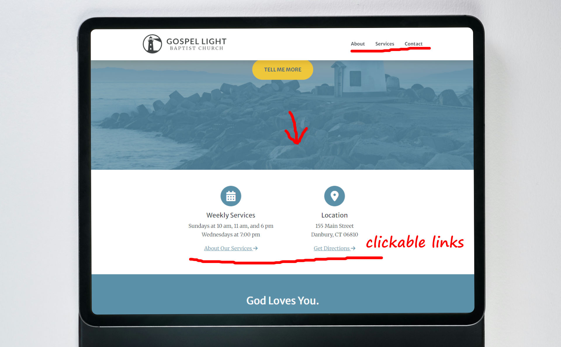
1. Are Your Service Times & Location Instantly Clear?
This is the most important information on your entire website. When someone is considering a visit, they have one main question: "When and where?" Don't make them hunt for the answer.
Your 30-Second Check: Open your homepage. Are the service times and physical address visible immediately, without having to scroll through blocks of information or click on a menu? If not, this is the most important change you can make. It is also a good practice to make the address a clickable link that opens directly in Google Maps.
2. Is There a Clear "I'm New" or "What to Expect" Section?
Attending a new church can be intimidating. Let's face it, there are all kinds of crazy churches out there. Potential guest want to know what they are getting themselves into. A dedicated page or section for first-time visitors is a powerful tool that lowers anxiety and encourages a visit. It tells people, "We are expecting you and you are welcome to join us!"
Your 30-Second Check: Find your page for new visitors. Read through it. Does it clearly answer a guest's most common questions?
- What is the service like?
- What should I wear?
- Is there childcare or a nursery?
- Where should I park?
3. Can People Actually Contact You?
If someone has a specific question or a need for prayer, they will look for a way to get in touch. Hidden or broken contact information is a dead end that communicates you're unavailable.
Your 30-Second Check: Find your "Contact Us" page. Is the phone number listed, and is it clickable on a smartphone? Send a test message through your contact form. Does it actually get delivered to a real person who can respond?
4. How Does It Look on a Phone?
The vast majority of your website traffic now comes from mobile devices. If your site is difficult to use on a phone, it's difficult to use for most of your audience.
Your 30-Second Check: Open your website on your smartphone. Turn it vertically. Can you easily read the text without pinching and zooming? Are the menu buttons easy to press with your thumb? A good mobile experience is non-negotiable today.
5. Does Your Church Look Active?
Are there old events from months or years ago still showing on your website? Are the only pictures from the church anniversary celebration 5 years ago? An out-of-date website gives the impression of a dead church. A visitor wants to see signs of life! Seeing recent activity shows that your church is a vibrant, thriving community.
Your 30-Second Check: Look at your homepage. What is the date on the most recent sermon, blog post, or upcoming event? If the latest update is from six months ago, it sends the wrong message. Either make sure there are recent items or remove any dated items. Having no events is better than having only old events.
Performing this quick check every few months is one of the easiest and most effective ways to ensure your digital front door is always open, welcoming, and ready for your next guest.
If you have any web questions or need advice for a particular website need, please let me know! I am always happy to help churches and ministries.